
InnovaMD Portal
Responsive Browser Application UI/UX Design
The Skins Factory’s Second Outing Designing InnovaMD’s Healthcare Portal.
The project’s discovery phase began with our team conducting User Research/Interviews. Over the course of 2 weeks, we interviewed Physicians, Clinic Administrators, and Office Personal, to learn the pain points they were experiencing with the prior version of the application, while discussing feature sets they wanted to see included in the new version of the portal. This research was vital in pinpointing where to make the necessary usability & interaction design changes.
Disclaimer: All patient names & non-patient names appearing in these works are fictitious. Any resemblance to real persons, living or dead, is purely coincidental.
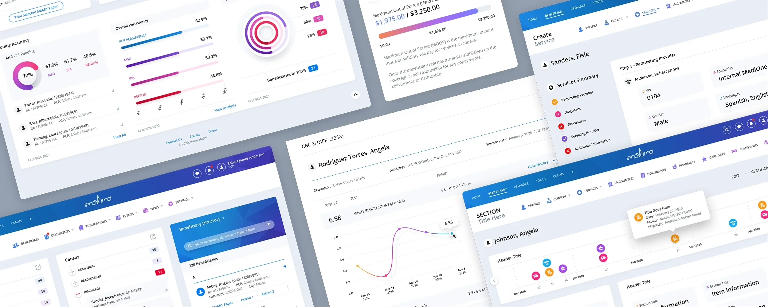
The Dashboard
The Dashboard was a complete UI/UX/IxD redesign from the ground up. Our initial comps used a more graphical, secondary navigation with a dark upper chrome for contrast. We opted to lighten and streamline the navigation area, while infusing a color gradient into the bar. Most of the Dashboard Modules include a Pop-Out icon. This is to extend the functionality and size of each module, while not interrupting the layout or forcing the user to leave the Dashboard. Clicking the icon sends the module to a Slide Out panel. Special attention was paid to making the Beneficiary Directory more robust than its predecessor. Our focus throughout the project was to speed up the user’s productivity, while increasing access to pertinent information, so healthcare workers could spend more time caring for patients, and less time interacting with the software application.
Below you can see a few of Dashboard Panels/Modules that have been expanded to a Slide Out Panel. Plus a look at a Navigation Dropdown Menu.


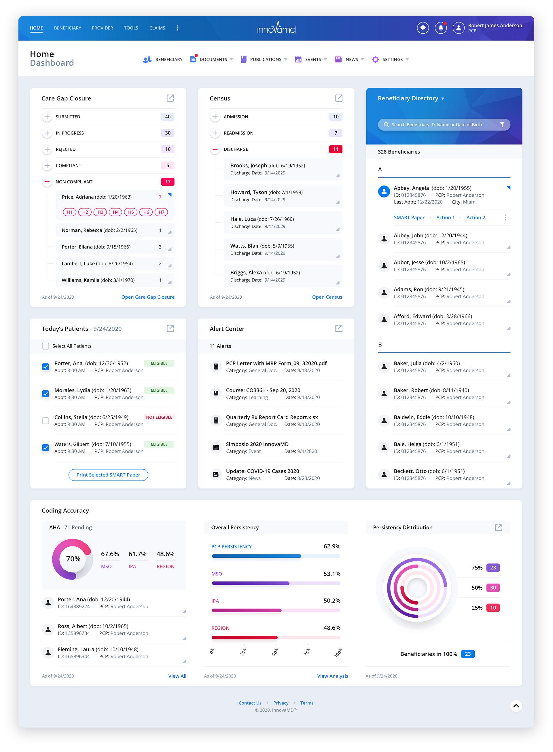
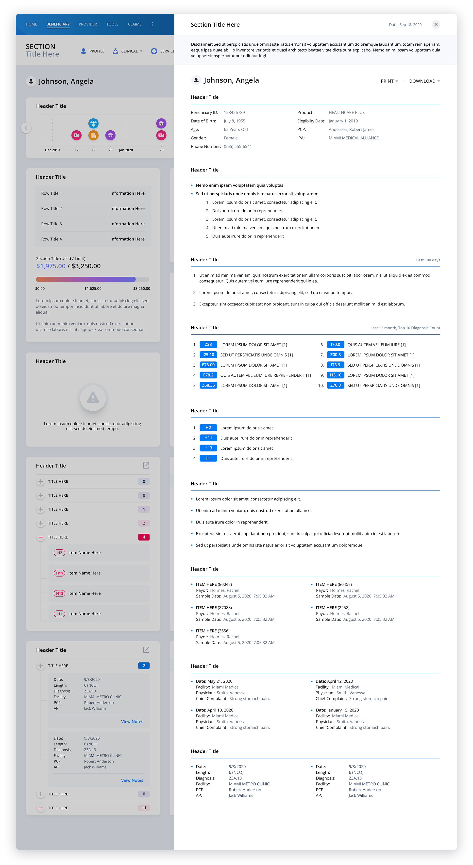
Patient Data Screens
Because of the proprietary nature of this screen and certain feature sets, effort has been made to keep core functionality intentionally vague. This was done to protect our client’s intellectual property.
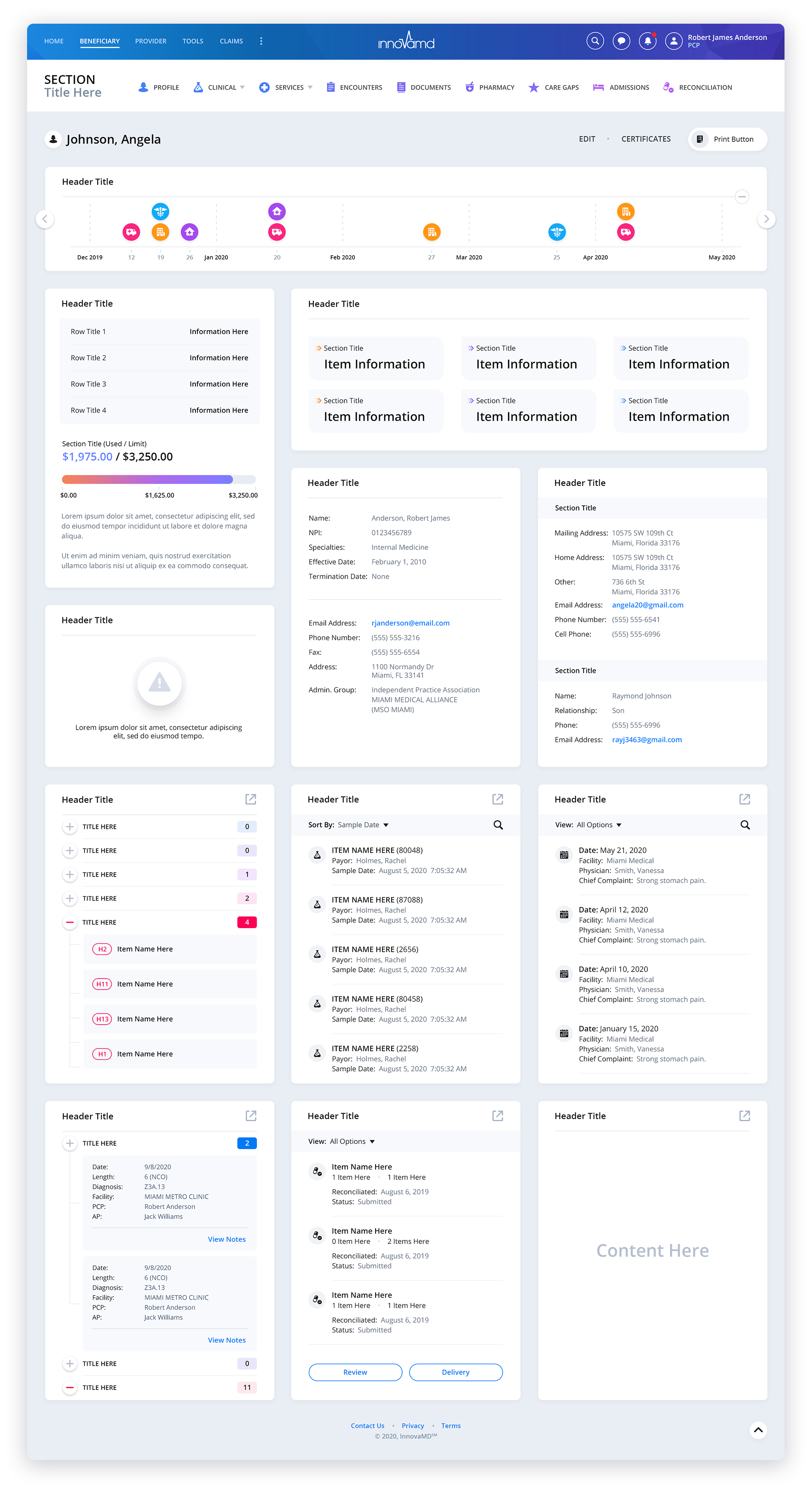
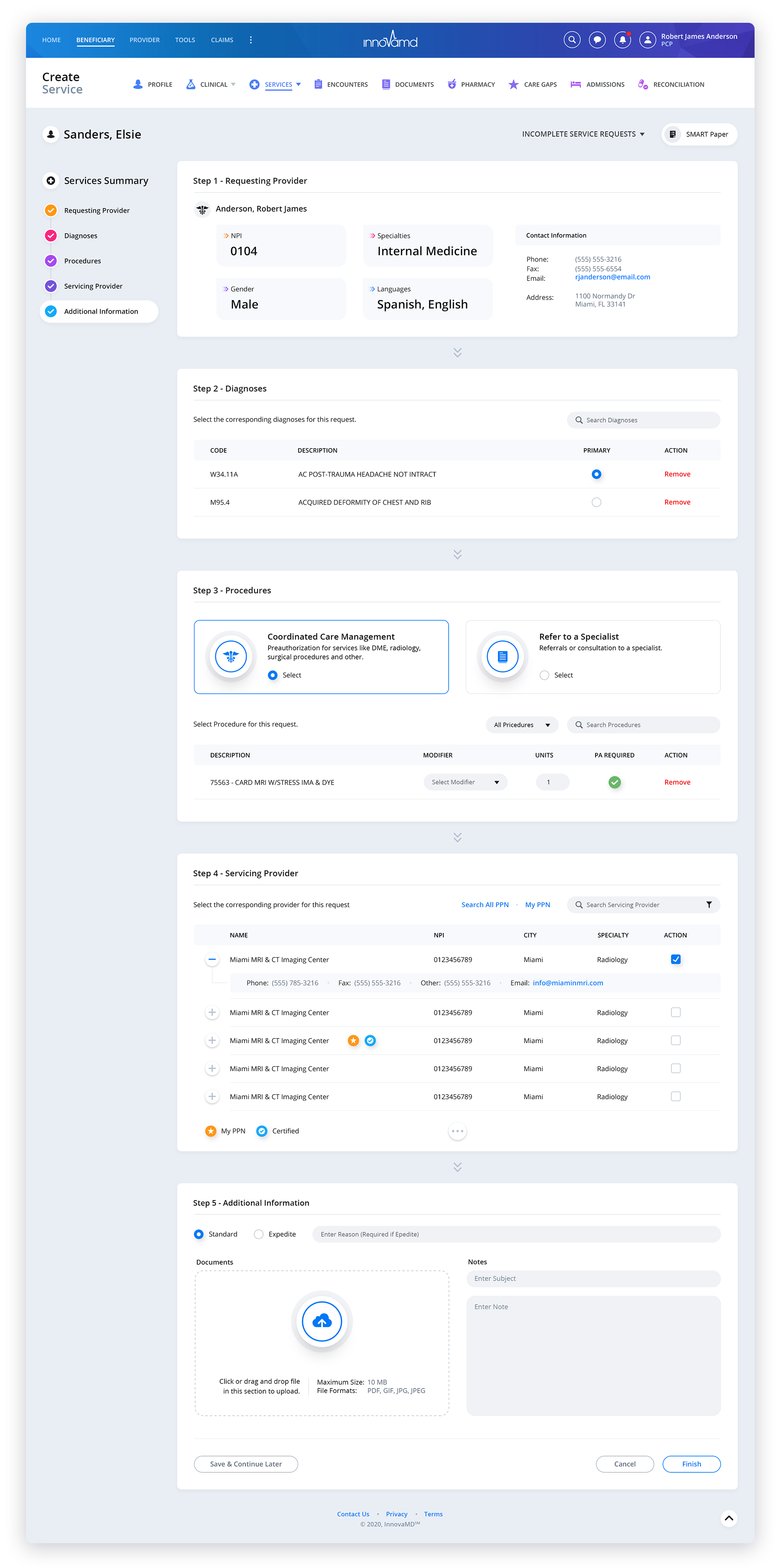
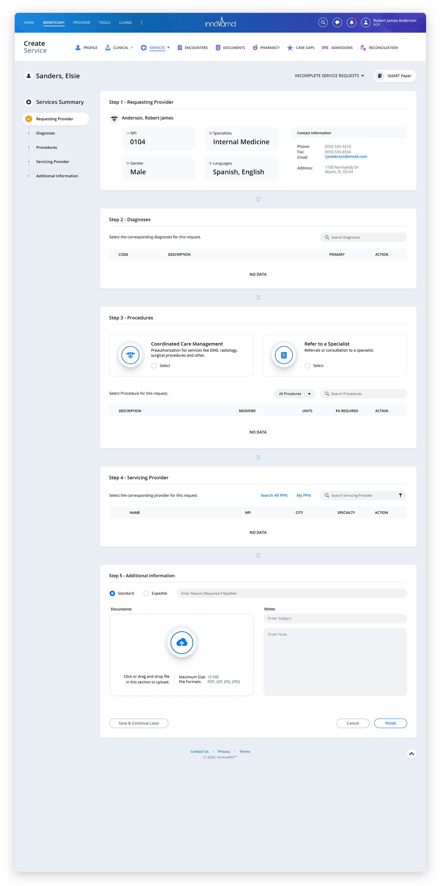
Create Service
To ensure an intuitive user experience, our user experience designers decided to implement a vertical progress sidebar for the screen. This addition allows users to easily track their progress as they navigate through each section. To make it even more convenient, a checkmark is displayed next to each section as the user engages with it, giving them a visual confirmation of their progress. We also made sure that the progress sidebar remains fixed and visible even as the user scrolls through the page content. This design choice was made with the intention of providing users with a seamless and effortless scrolling experience. By keeping the progress sidebar in view at all times, users are constantly reminded of their position within the overall progression. This strategy of implementing a vertical progress sidebar serves as a valuable tool in enhancing user engagement and reducing any potential confusion. It ensures that users have a clear understanding of where they are in the process, allowing them to easily navigate through the different sections, which ultimately contributes to an overall positive user experience, making their journey through the screen as seamless and hassle-free as possible.


Lab Results


Services


Medication RECONCILIATION


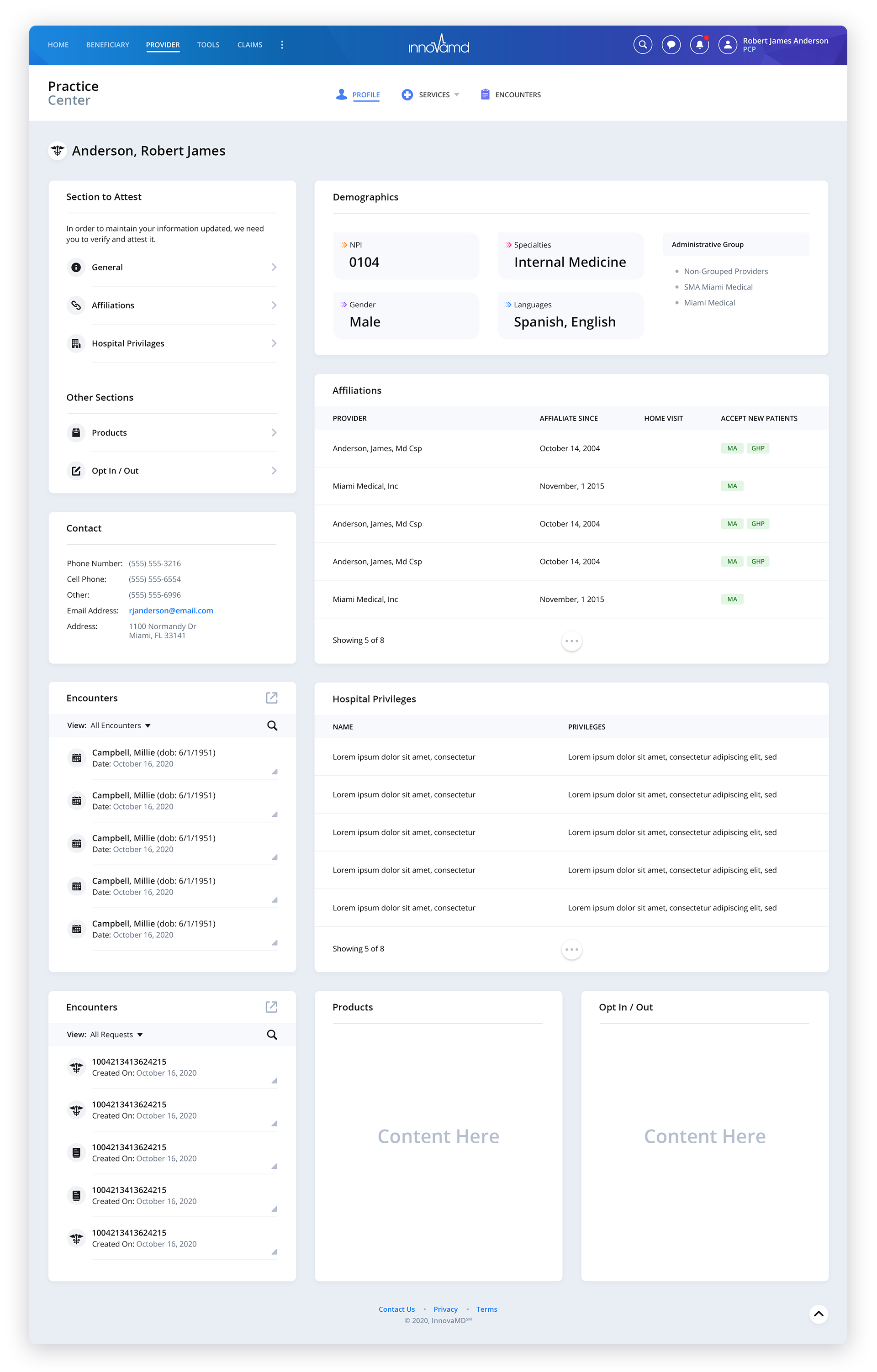
Practice Center
Have a project in mind? Let's talk.
Thank you for reaching out.
We will be in touch within one business day.